Ecommerce
Reimaging The Digital Marketplace
COMPANY
CrowdCargo
ROLE
Product Designer
EXPERTISE
UX/UI Design
YEAR
2025
Project description
CrowdCargo is a digital e-commerce logistics platform that connects users to affordable, efficient delivery services. The platform allows individuals and small businesses to send, receive, and track packages locally and internationally with ease and many more.
🎯 Goal
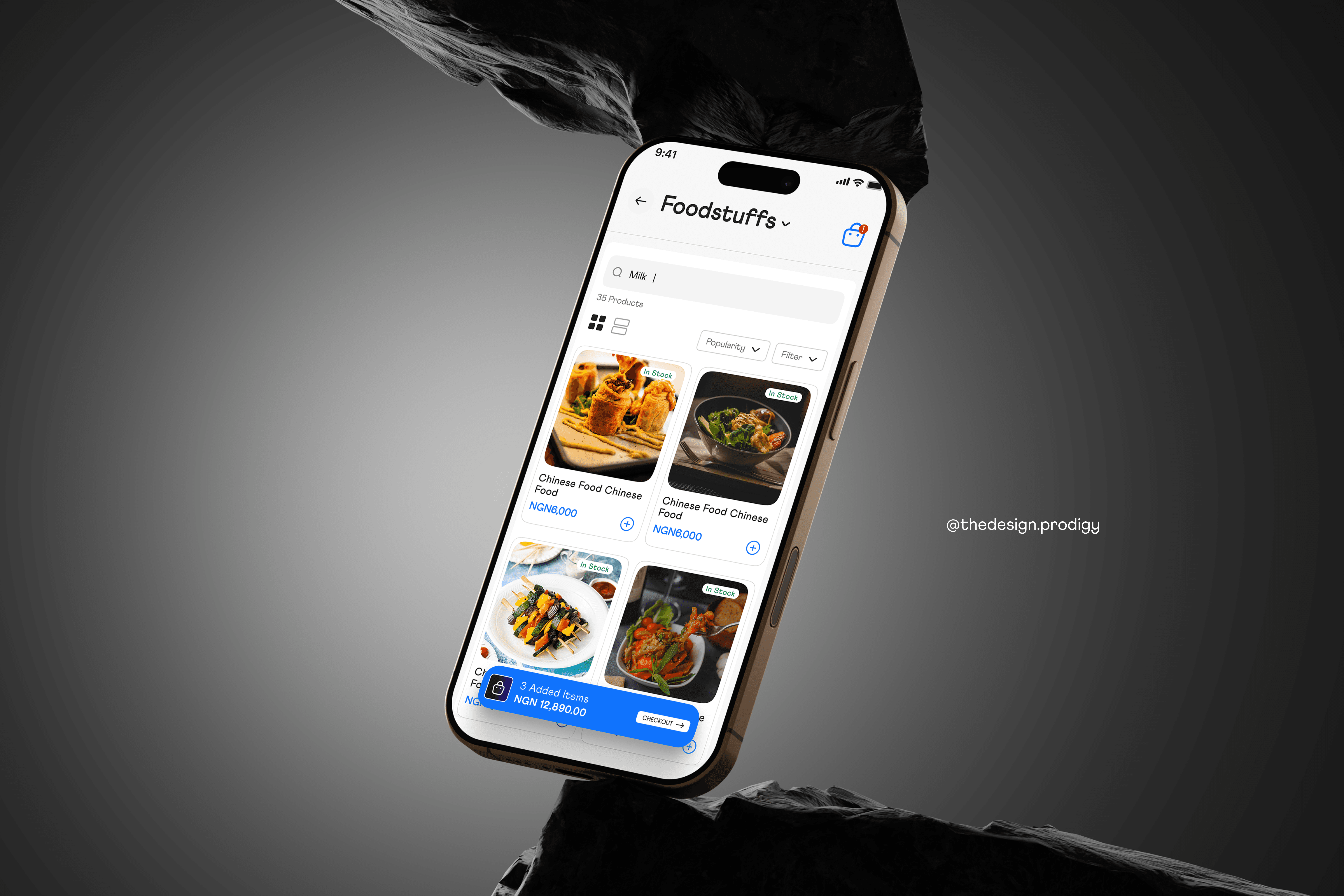
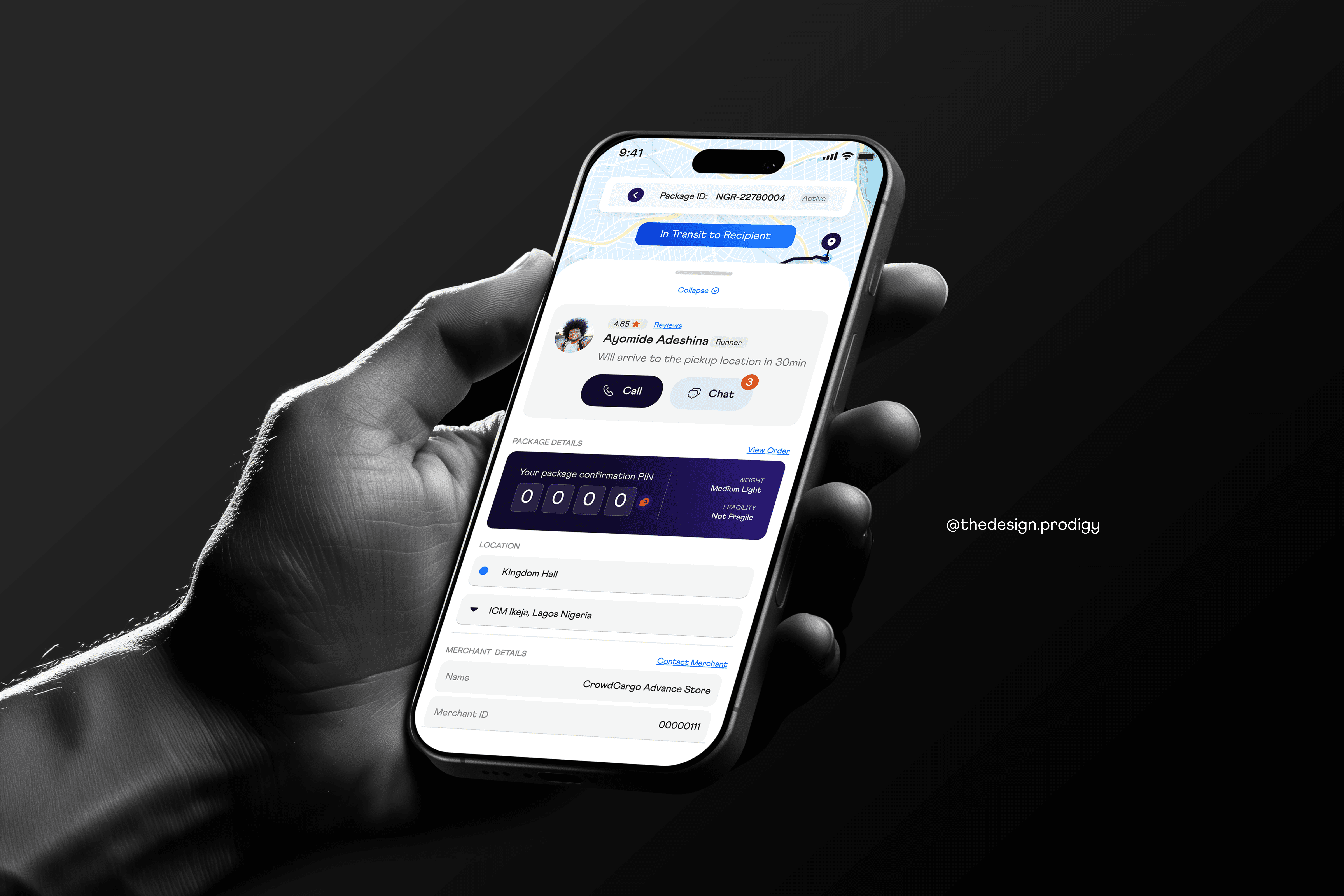
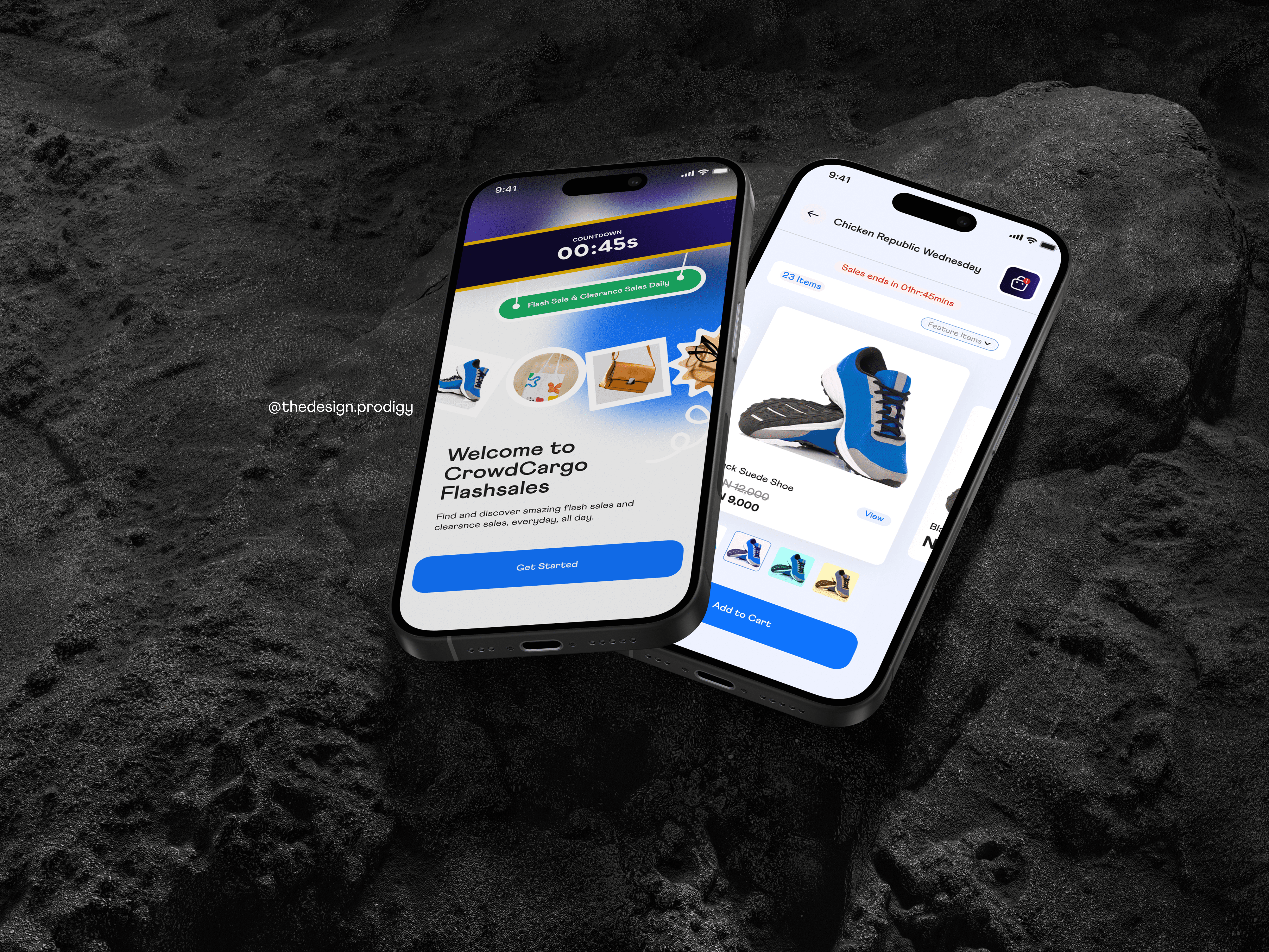
Redesign the CrowdCargo mobile and web apps to achieve a cleaner, modernized look while solving key usability issues in the booking, tracking, and payment flows.
👨🏾💻 My Role – Product Designer
Led full UI/UX redesign across mobile (Runner & Customer) and web (Vendor & Customer)
Developed a modern, consistent design system
Prototyped and tested core user flows
Collaborated closely with product managers and developers for implementation
🔍 Challenges Identified & Solution
Less Exciting Design System
The previous design system seemed quite outdated and lacked the excited needed to improve user engagement, below you see the comparison between the problem spotted on the Beta design system (Old) and how it was solved in the Alpha design system (New)
Long and Frustrating User Flow
One of the major problems identified was a long and overwhelming user flow, especially in the onboarding process. Users were required to go through multiple steps across several screens, all of which led to drop-offs and frustration
✅ Solution: Collapsing & Prioritizing Key Information
To solve this, I restructured the flow by collapsing less critical sections and surfacing only the most important information upfront—using progressive disclosure. This meant:
Grouping related inputs into logical sections
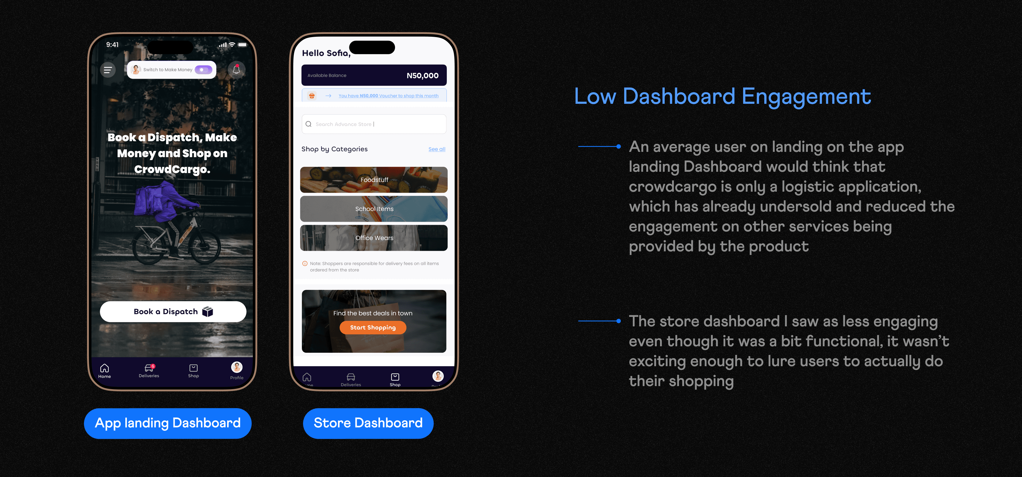
Low Dashboard Engagement
One key issue identified during the redesign of CrowdCargo’s dashboard was that many important user actions were hidden or buried deep in submenus. The dashboard is often the first and most frequently visited screen in any e-commerce or logistics product. However, in CrowdCargo's case, the core dashboard lacked visibility and direct access to essential user actions, which had a noticeable impact on engagement.
Beyond functionality, the look and feel of the CrowdCargo dashboard also played a big role in reducing user engagement. While the platform offered helpful features, the visual presentation failed to invite users to interact with them.
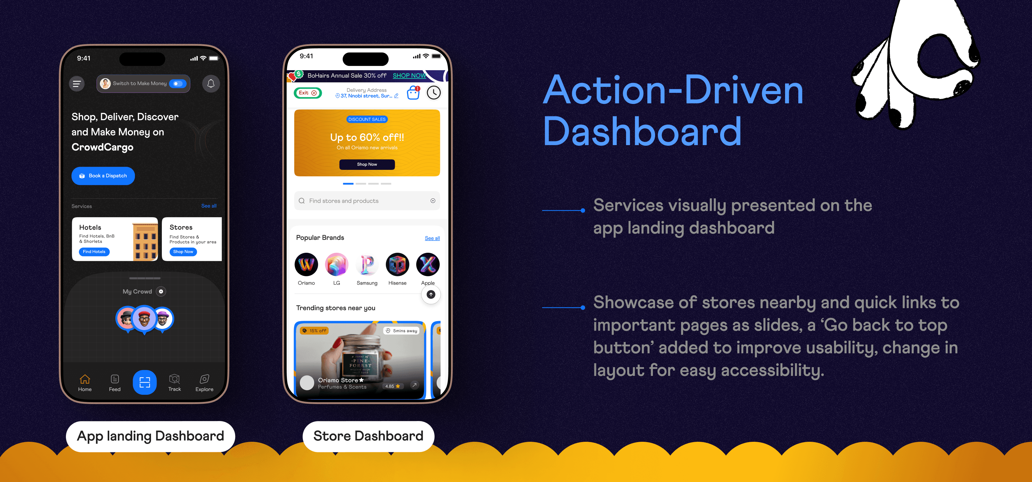
✅ Design Solutions: A Visually Engaging, Action-Driven Dashboard
To address this, I redesigned the dashboard with a task-focused and action-driven layout, which included:
Surface Key Actions
Visual Hierarchy: Used visual cues (icons, color accents, spacing) to guide users toward the most-used features.
Dashboard Customization: Allowed users to personalize their dashboard with widgets
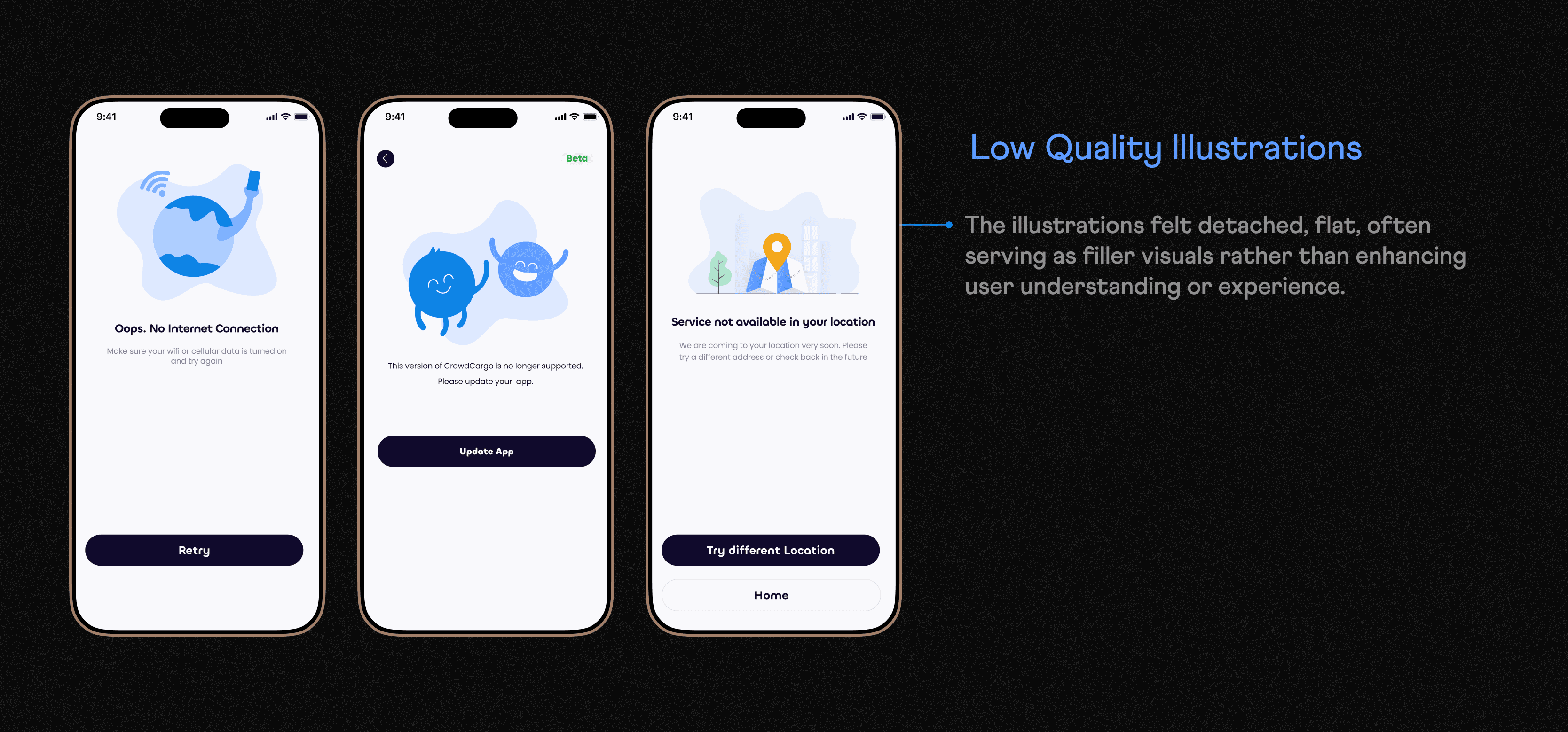
Low-Quality, Unengaging Illustrations
One key design issue on CrowdCargo’s platform was the use of low-quality, generic illustrations that failed to reflect the brand’s personality or connect emotionally with users. The illustrations felt detached, flat, often serving as filler visuals rather than enhancing user understanding or experience.
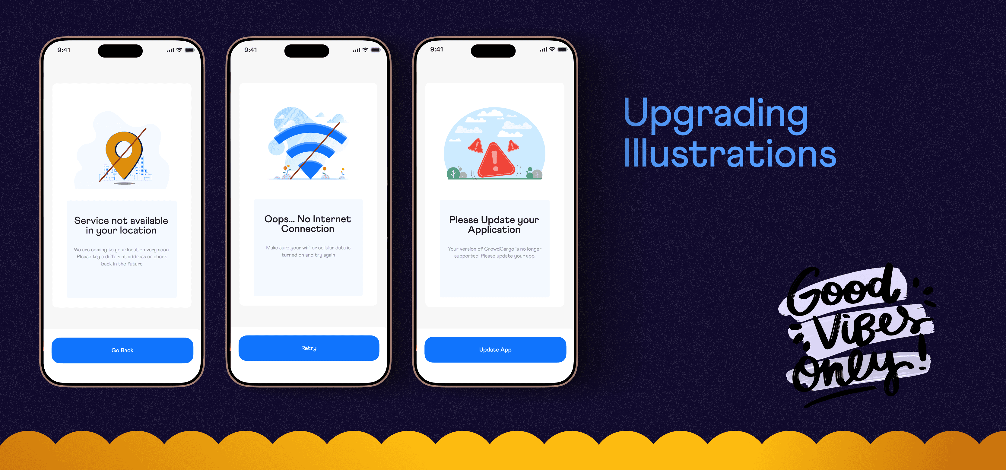
✅ Solution: Upgrading to Purposeful, Brand-Aligned Illustrations
To solve this, the illustration system was reimagined to be more intentional, consistent, and engaging
🚀 Overall Result: Redesign from Beta to Alpha
The redesign of CrowdCargo from beta to alpha marked a major leap in user experience, visual design, and product usability. The beta version, though functional, struggled with low engagement due to long user flows, hidden core actions, outdated visuals, and generic illustrations that didn’t reflect the brand’s identity or support user tasks.
Through the alpha redesign:
User engagement significantly improved, as essential actions like booking, tracking, and payment were surfaced clearly and made easier to complete.
The dashboard became action-oriented, replacing static layouts with interactive, personalized elements.
Illustrations were upgraded from low-quality, generic visuals to brand-aligned graphics that added personality and clarity to key screens.
The entire app experienced a visual refresh—modern, clean, and consistent across platforms—boosting trust and user retention.